Table of Contents
The Role of Color Theory in Viral AI Video Production
Picture this. An e‑commerce manager spends hours tweaking hooks, offers, and targeting, but her TikTok and Reels ads still get scroll-passed in under two seconds. Then a creator posts a scrappy, slightly blurry video using the brand’s product, with warm cozy colors and a punchy accent, and it crushes her “polished” ads by 3x CTR.
Same product. Same offer. Different color choices on screen. That is not an accident.
If you are running AI-generated or UGC-style videos for paid social in the US, color is one of the fastest levers you can pull to change how your audience feels, clicks, and buys. With creator costs rising and ad fatigue hitting faster, understanding color theory is a very practical way to squeeze more revenue out of every impression.
In Short:
- Color choices in your AI and UGC videos strongly affect scroll-stop rate, CTR, and perceived trust.
- Warm vs cool palettes, contrast, and brand consistency should be planned, not guessed.
- AI tools can systematically test color combos faster than human creators alone.
- Platforms like ViralBox help you pair smart color choices with High-Converting UGC Ads to reduce CPA.

Quick Visual Guide: Color Choices That Help Or Hurt Your Viral AI Videos
✅ Do This
- Use high contrast between text and background so hooks are readable on mobile.
- Stick to 2–3 brand colors plus 1 accent color for CTAs.
- Match mood to offer: warm & cozy for lifestyle, cool & crisp for tech or efficiency.
- Test color versions of your first 3 seconds to boost scroll-stop rate.
🚫 Avoid This
- Low-contrast overlays that disappear against busy backgrounds.
- Too many clashing colors fighting for attention in one frame.
- Using brand colors that vanish on TikTok or Reels UI (for example, white on bright backgrounds).
- Random color changes between scenes that feel chaotic instead of intentional.
📊 Fast Wins With Color
- Try warm thumbnails for “human story” hooks and cooler ones for “data or proof” hooks.
- Use one consistent CTA color so viewers learn to associate it with action.
- Contrast your brand palette with the typical feed colors on each platform.
- Leverage AI for A/B Testing Content Hooks and color combos at scale.
Why Color Theory Matters In Viral AI Video Production
Color is your fastest scroll-stopper
On TikTok, Instagram Reels, and YouTube Shorts, people swipe past your video in under 1.5 seconds if nothing catches their eye. Before the viewer hears your hook or reads your overlay, their brain has already judged the frame by color and composition.
Want to know a secret? Your thumbnail frame and first second of color composition might matter more than your 30-second script in terms of pure reach. That is especially true when you are running performance ads where the algorithm rewards early engagement.
How color affects US shoppers psychologically
Color theory is basically the science of how people emotionally react to color combinations. Here is how it usually plays out in direct response ads targeting US consumers:
- Warm colors (reds, oranges, yellows) feel energetic, urgent, emotional. Great for sales, limited-time offers, and “problem–solution” UGC.
- Cool colors (blues, greens, purples) feel calm, trustworthy, and professional. Strong for health, finance, SaaS, and anything promising “control” or “clarity”.
- Neutrals (white, grey, beige, black) keep things clean and premium, especially for beauty, fashion, and high-ticket items.
- High saturation can pull attention quickly but also feels shouty if overused.
- Low saturation feels subtle and lifestyle-focused but can blend into the feed if not anchored with contrast.
When you ignore these patterns, you accidentally send the wrong emotional signal. A stress-relief product using harsh red overlays, for example, feels more like an alarm than a solution.
The feed is fighting your color choices
Your video does not live in a vacuum. It competes with the rest of the feed UI.
- On TikTok, there is a bright white UI, buttons, and text around your frame. Light pastels can vanish into that environment.
- On Instagram Reels, a lot of content is either softly filtered or highly saturated. Medium contrast gets ignored because it feels “like everything else”.
- On YouTube Shorts, thumbnails and titles often carry strong reds and whites. Doubling down on the same palette can make your brand disappear in the crowd.
If your AI-generated video uses colors that blend into the platform’s UI, your hook and CTA become invisible. That leads directly to low CTR and higher CPA, even if the story and offer are solid.
Color, clarity, and conversion
Past a certain point, your performance metrics start to plateau not because your offer is weak, but because your video is visually confusing.
Listen up: every extra color or pattern introduces one more micro-decision for the viewer’s brain. When there is no clear focal point, attention scatters.
Good color theory in AI video means:
- One dominant color palette for the background or environment.
- One clear accent color for CTAs and key text.
- Sufficient contrast so text and product stand out even at low brightness.
That clarity directly supports higher click-through and stronger conversion, because viewers can instantly understand what matters on screen.
How AI Video Tools “See” Color In Practice
AI models do not see color the way we do. They are not thinking, “Ah, nice teal for a calming vibe.” They parse pixels, patterns, and relationships between hues. They learn, for example, that bright red next to a “shop now” button correlates with conversion in a training dataset, or that skin tones look more “authentic” under certain lighting and saturation settings.
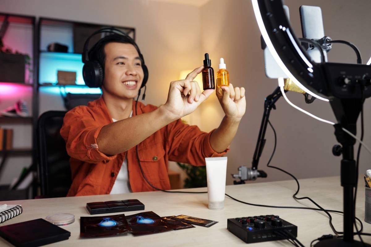
When you use something like AI Avatar Video Generation for Virtual Spokespersons, the system is making color-related decisions about:
- Skin tone realism and warmth.
- Clothing colors that contrast with background.
- Lighting that makes facial expressions readable at small sizes.
- Backgrounds that keep the spokesperson visually dominant.
If you give the AI no direction, it will pick “good enough” defaults. But if you guide it with clear color rules, you can intentionally shape how the viewer feels, and how likely they are to stop and listen.
Turning Color Theory Into Performance: Practical Playbook With ViralBox
1. Start with a simple color framework, not a moodboard rabbit hole
You do not need a design degree. You need rules you can execute fast. Try this framework for your AI and UGC ads:
- Base palette (2 colors): core brand colors that appear on packaging or your website.
- Neutral anchor (1 color): white, off-white, black, or charcoal for backgrounds or text.
- CTA accent (1 color): a high-contrast color reserved for “Tap to learn more”, “Try it now”, or price tags.
When you generate scripts using Authentic UGC Ad Scripts, add a visual note to each script variation, like “Use warm beige background, brand blue for logo, bright orange CTA bar.” This keeps your creative output consistent as you scale.
2. Use AI Avatars to systematically test warm vs cool stories
Instead of arguing in Slack about which vibe will work, let the numbers decide.
With AI Avatar Video Generation, you can spin up multiple versions of the same script:
- Version A: Warm palette (soft oranges, beiges, warm lighting), used for emotional “I was struggling with X…” testimonial scripts.
- Version B: Cool palette (blues, teals, clean whites), used for rational “Here is what changed in 7 days” proof-driven scripts.
Run these as separate ad sets, same budget and targeting, and watch which color story your US audience responds to. You might find, for example, that warm “problem” hooks get higher scroll-stop, but cool “proof” scenes close the sale.
3. Treat your first 3 seconds like a color A/B lab
Your hook is not just what you say. It is also how the colors hit the viewer’s eye.
Use A/B Testing Content Hooks to test variations such as:
- Hook A: Bold white text on a deep brand color background.
- Hook B: Text over a blurred UGC-style shot with a strong color filter.
- Hook C: High-contrast black text on a bright pastel gradient.
Even with the exact same words, these will perform differently. Once you find a winning color structure for your hooks, lock it in as a template and reuse it across dozens of products.
4. Align product visuals to your palette with one-click workflows
When you connect your store or upload media, you want your product shots to feel like they naturally belong in your video.
With ViralBox, you can use your product images and turn them into a One-Click Product Video where the AI automatically frames the product and surrounding colors to highlight it properly. That means:
- Backgrounds that contrast with your packaging color so the item pops instantly.
- Text overlays that do not sit on top of the main brand logo.
- Light color grading that keeps skin tones realistic while boosting the product’s vibrancy.
Instead of manually editing every asset, you define your brand’s “color rules” once, then apply them at scale across dozens of SKUs.
5. Plan your feed as a color story, not just a content calendar
Ad fatigue is not only about seeing the same hook. It is also about seeing the same visual flavor again and again.
Using Content Distribution at Scale, you can plan your content like this:
- Week 1: Warm palette focus, emphasizing transformation stories and UGC-style testimonials.
- Week 2: Cooler palette focus, emphasizing “how it works” and credibility (clinical, data, side-by-side comparisons).
- Week 3: Mixed palette, but consistent CTA color and typography to reinforce brand recall.
This approach keeps your feed visually fresh while still feeling like one cohesive brand. The algorithm sees newness, your audience sees consistency, and your CAC benefits from both.
6. Build templates so your team stops guessing
If you are working with multiple freelancers, agencies, or internal team members, color chaos creeps in fast.
Create a simple “Color for Performance” checklist and lock it into your ViralBox workflow:
- What is the background color or environment vibe for this concept?
- Which color is reserved for CTAs only?
- Are we using high contrast for the hook text, yes or no?
- Are product colors true-to-life and not distorted by filters?
Once this is defined, your content creation inside ViralBox becomes plug and play. Your High-Converting UGC Ads start looking like they belong together, and the brand feels more premium without extra editing time.
Unlock Your Conversion Potential. Try ViralBox Today!
Your Move: Stop Guessing Your Colors, Start Testing Them
If your ads are “fine” but not scaling, there is a good chance your color choices are working against you. The good news is you do not need more creative meetings, you need more structured tests.
Use color theory as a performance tool, not an aesthetic debate. Give your AI videos clear rules, use ViralBox to spin up variations quickly, and let your metrics tell you what your audience actually responds to.
You are already putting money into media spend. A little intentional work on color can be the difference between “barely breaking even” and “this creative just dropped our CPA by 30 percent.” If you are a marketer or business owner juggling a million things, this is one lever you can systemize and then stop worrying about.
Frequently Asked Questions (FAQ)
Does AI understand color theory?
AI does not experience color like humans, but it does learn color patterns. Models interpret color as numerical pixel data and recognize how certain combinations tend to perform or appear. In practice, that means AI sees which colors usually appear in high-converting ads, flattering skin tones, or trustworthy layouts, and can mimic those patterns even though it is not “feeling” the colors.
What is the purpose of color theory in video editing?
Color theory in video editing is about guiding the viewer’s emotional reaction. Different hues, brightness levels, and saturation levels create different moods, from urgency to calm to luxury. When you edit with color theory in mind, you choose palettes and grading that support the goal of the video, such as getting a click, a purchase, or a sign-up, instead of leaving that emotional impact to chance.
What is the viral color theory?
Viral color theory refers to how color can trick or steer our perception, the same way that viral illusions like the blue/black or white/gold dress did. Our brains interpret color based on surrounding colors, lighting, saturation, and context. For marketers and creators, this means you can use contrast, temperature shifts, and strategic palettes to make certain elements feel more vivid, more trustworthy, or more surprising, which helps content stand out and spread more easily.